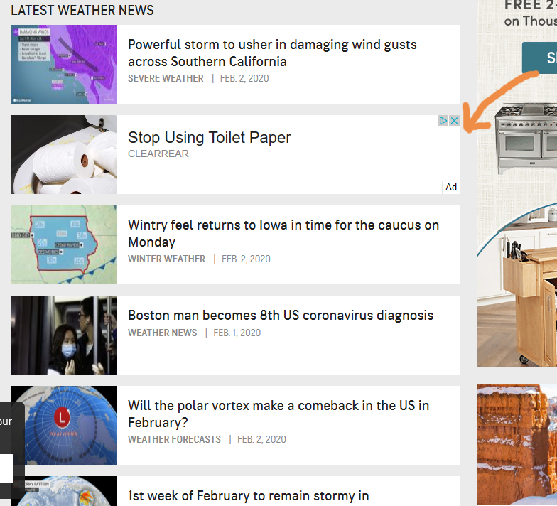
With its short and unexpected headline–surrounded by whitespace, we found it hard to resist clicking on this banner. And the conversational tone of the ad’s landing page does a great job of paying off on the headline and discussing a somewhat uncomfortable topic.
To create a sense of urgency, the wording of the landing page’s ‘call to action’ (CTA) button is ‘Check Current Availability’ rather than the expected and tired ‘Add to Cart’ or ‘Buy Now.’
Everything about the small banner ad and landing page is well done until I got down to the testimonials, just beneath the CTA button. The testimonials are impressive and designed to look like typical Facebook reviews (with the inclusion of the thumbs up icon and matching font and profile avatars) but this section is actually just a static, screen snapshot. And when I did a Facebook search for any of these people, none of them appear to exist on Facebook. Unfortunately, this makes me question the honesty of anything else that appears on this otherwise excellent landing page.
(Archival snapshot of ClearRear landing page.)

 Best Ads to Help Generate Big Ideas


