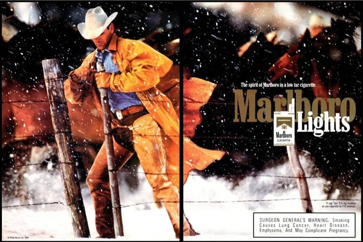
It’s amazing how there are very little (if any) copy in these gorgeous layouts and the people are often not even using the product! They rely strictly on appealing to the market’s longing for freedom, toughness, individualism, comradery, and independence. Here are other print ads in this campaign that supported their billboards and tv commercials…
best print ads
Versatile Marketing Piece | Brodo
Not sure if this is a mailer or social media advert. The beautiful piece is so warm, inviting and friendly, however, that it would work wonderful in many different applications. Their portable kitchen, cups, and every element of the shop benefits from wonderfully consistent branding.
This waste bin would be a fabulous design […]
Twisting a Negative Reputation into a Positive Feature – Vespa
Pretty bold advertisement! It makes light of the product’s negative association while also demonstrating a product benefit.
Example of Visual Typography – Depression Hotline
Nice example of visual typography – where how the words are displayed carries the weight of communicating the message.
Funny Moving Company Ads – Vice the Mover
Here are a couple more ads in this humorous campaign…
Countering Negative Reviews – Oatly Oat Milk
What a bold headline! It’s interesting that the product name isn’t in the headline or bodycopy. And no logo. Just the packaging as an identifier. Addressing product negatives up front (preemptive objection handling) is a great way to build credibility, demonstrate transparency, and proactively address any doubts or hesitations the customer may have. This approach […]
Great Example of Visual Metaphor – Police Office on Lookout from Corner Ceiling
What a great example of visual metaphor!
Public safety ad and commercial – car dropped off 10 story building | Mobil Oil
This amazing commercial was supported with this brilliant print advertisement…